Layout 1:
Introduction: Summary 1 + summary 2.
Body 1: Graph 1.
Body 2: Graph 2.
Layout 2:
Introduction: Summary 1 + summary 2 + correlation (Viewed/Seen together,... )
Body 1: Correlation 1.
Body 2: Correlation 2.
For example:
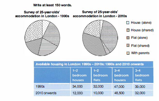
The pie charts and the table show the types of living accommodation occupied by 25-year-olds in London during the 1990s and the 2010s, and the availability of different types of accommodation in London during the same two periods.
Summarize the information by selecting and reporting the main features and make comparisons where relevant.
According to the table, the decade of 2010 witnessed a dramatic fall in the number of 1-2 bedroom houses from 34,000 to 12,000. In contrast, there was a slight rise in the group of 3-4 bedroom by 1,500. As a consequence, more shared houses were chosen rather than smaller ones. Shared houses in the 2010s were almost twice as many as they had been in the 1990s meanwhile smaller houses were reduced by half in the same time frame.
A similar pattern applied to the flat. The quantity of small flats in the 2010s dropped over threefold compared to the 1990s while the larger ones experienced a slight dip. This phenomenon had an effect on the choice of flat among young adults which tended to opt for shared apartments.
Life with parents was also affected. Slightly fewer 25-year-old people lived with their parents accounting for just under a quarter in the survey in the 2010s.
Không có nhận xét nào:
Đăng nhận xét